Oh happy day! It’s been like pulling teeth to get to this point, but FINALLY the Accurance Group has finished the interior formatting for WATERSPELL Book 1: The Warlock, and also for Book 2: The Wysard.
I expected this part of the process to be quick and easy. They took the text straight from my Word .doc files and formatted it as printable PDFs with running heads and justified margins. “What could go wrong?” I asked myself.
Let me count the ways:
ENDLESS REVISION After ENDLESS REVISION
ORIGINAL OUTPUT (8/22/2011): They omitted all of the front matter that I’d supplied: copyright page, dedication, Contents page, epigraph.
FIRST REVISION (9/6/2011): They inserted the front matter OK, but they introduced a typo (theirs, not mine) into the dedication page, a strange, stray hyphen: “an–d its sequels.”
SECOND REVISION (9/14/2011): Whereas I’d been expecting this run of galley proofs to be the final, clean copy, they inexplicably fouled up the established, customer-approved pagination scheme. They dropped the blank book-page (a page that we’d intentionally left blank) after the Prologue, with the result that all of the pages from Chapter 1 to the end of the book were no longer correctly numbered. They replaced the formerly correct page numbers on the Contents page with the now-incorrect page numbers. Instead of centering the epigraph on the page facing the Prologue, they set it flush-left. And they mistakenly slapped running heads on the first page of the Prologue and the first page of Chapter 1. (I described this mess in detail at "Me, My Team, and DIY.")
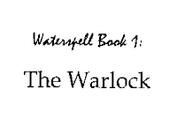
 THIRD REVISION (9/17/2011): Things got quite interesting at this point. Previously, the first line of the book’s title, on the title page, had been set in the font shown at left. I wasn’t crazy about it, but it was readable and I was OK with it. But suddenly, on this particular proof run, that first line showed up in Mistral (calligraphic—second image at left).
“Wow!” I thought. “Somebody is finally taking an interest in this project. They’ve given some thought to how a faux-medieval fantasy novel should be presented.” I’m not sure I would have chosen Mistral, if I’d been doing the choosing, but I was so pleased to see a glimmer of interest on the part of the typesetter, I happily accepted this change of typefaces.
But the danged epigraph was still not right. They’d finally got it centered left-to-right, but it was crowding the top margin. While all of this back-and-forth had been happening with Book 1, Accurance had successfully finished the page formatting for Book 2. And the Book 2 epigraph was attractively centered on its page, both horizontally and vertically (top-to-bottom as well as left-to-right). Of course, I wanted the Book 1 epigraph to be presented the same as the Book 2 epigraph (this is a series, after all); and so that is what I requested.
FOURTH REVISION (9/30/2011): Oh my God! Will you LOOK at what they did to the first line of the title, on the title page? Without authorization—without a word of permission from me—they changed the font from Mistral to some kind of dreadful Edwardian script. Nothing could be less appropriate for these world-hopping science-fictional fantasy novels of mine. I almost puked. (I fully lost my temper.)
On the plus side, the epigraph had finally found its proper spot in the middle of the page facing the Prologue, but the line-breaks within the epigraph were still not correct. No matter how many times I said to “Set it up like the epigraph in job # 8917” (their number for my Book 2), they had failed to do it.
Of course, by this point I would have let the danged epigraph go, in the interest of moving these books along to the next process. (I was hoping for an October release date for the POD paperbacks, but that’s unlikely to happen now.)
Under no circumstances, however, could I accept that horrible Edwardian script on the title page. So I sent the proofs back for yet another run.
FIFTH REVISION (10/4/2011): Oh happy day! Mistral is back on the title page, the Book 1 epigraph finally looks like the Book 2 epigraph, I’ve signed off on the galley proofs, and we can finally go to the next step. It’s taken at least two weeks longer than it should have to get to this point, but at last we can proceed.
LOOKING AHEAD: TASKS 3 and 4
The package of services I bought from Accurance.com includes (1) cover design, (2) interior formatting, (3) print publishing setup and distribution, and (4) e-book conversion and distribution.
Now that we’re finally finished with steps 1 and 2—covers and interiors—I’m hoping that steps 3 and 4—POD publishing (Lightning Source) and e-book distribution—will move along quickly and simultaneously.
If you can stand the suspense, keep checking here on my blog. I’ll continue to post progress reports.


This comment has been removed by the author.
ReplyDeleteI, too, am glad the Edwardian script has been taken care of.
ReplyDelete