Steps to Publication #5: Proofing Galleys and Cover Art

Three things occupy my thoughts this morning. I’ll take them in order.

Tricks, Techniques, and Tactics from Authors Jan Peck and David Davis

Yesterday at the North Texas SCBWI chapter meeting, Jan Peck and David Davis gave a concise, knowledgeable, and highly useful overview of the state of publishing today. Besides describing their own steps to publication, starting in such periodicals as Comic Buyers Guide and the Dallas Morning News, and onward through their current status as star authors at Dial Books (Penguin/Putnam), Simon & Schuster, and Sterling Publishing, Jan and David presented an in-depth look at the industry-changing explosion in indie publishing and e-books. Their handout (worth its weight in gold, which is really saying something, considering that gold now sells for $1,800 an ounce) is posted at The Jan Peck/David Davis Publishing Link Sheet.

A lively discussion ensued, and when I saw my chance to join it, I threw in a few words about avoiding the temptation to throw rough drafts up on the Internet. The speed of publishing, online and electronically, can be intoxicating, especially to those of us who have lots of experience with the sad old routine of “send in your manuscript, then wait a year or six months” for a reply. It can be oh, so tempting, to e-publish and be damned.

But running a rough draft through the Smashwords meat-grinder is a very bad idea. E-publishing one’s unpolished prose can do considerable damage to a writer’s reputation. It is ALWAYS worth the time, to take the time to polish up a manuscript, to make it the best it can be.

I’ve posted several practical how-tos:
Thank you again, Jan and David, for a great program. I was already excited about my indie publishing adventure, and now I can hardly wait to get WATERSPELL out there.

Book 1: First Galley Proofs

Eager though I am to release WATERSPELL Books 1 and 2, I mustn’t lose my focus on quality. Gene has finished proofreading Book 1: The Warlock and declares it error-free. Today I’m going to skim quickly through the first galley proofs, making sure the poems and other bits that require special treatment (indentation, italics) have been properly handled.

Then, on the Contents page, I’ll assign page numbers alongside the chapter titles. Using the Accurance.com “Galley Edits—Corrections Sheet,” I’ll specify the placement of the copyright page, dedication, Contents, epigraph, and author bio. By Monday evening, this first run of galley proofs should be ready to return to Dwight, the production manager at Accurance.

Book 3: First Cover Proof

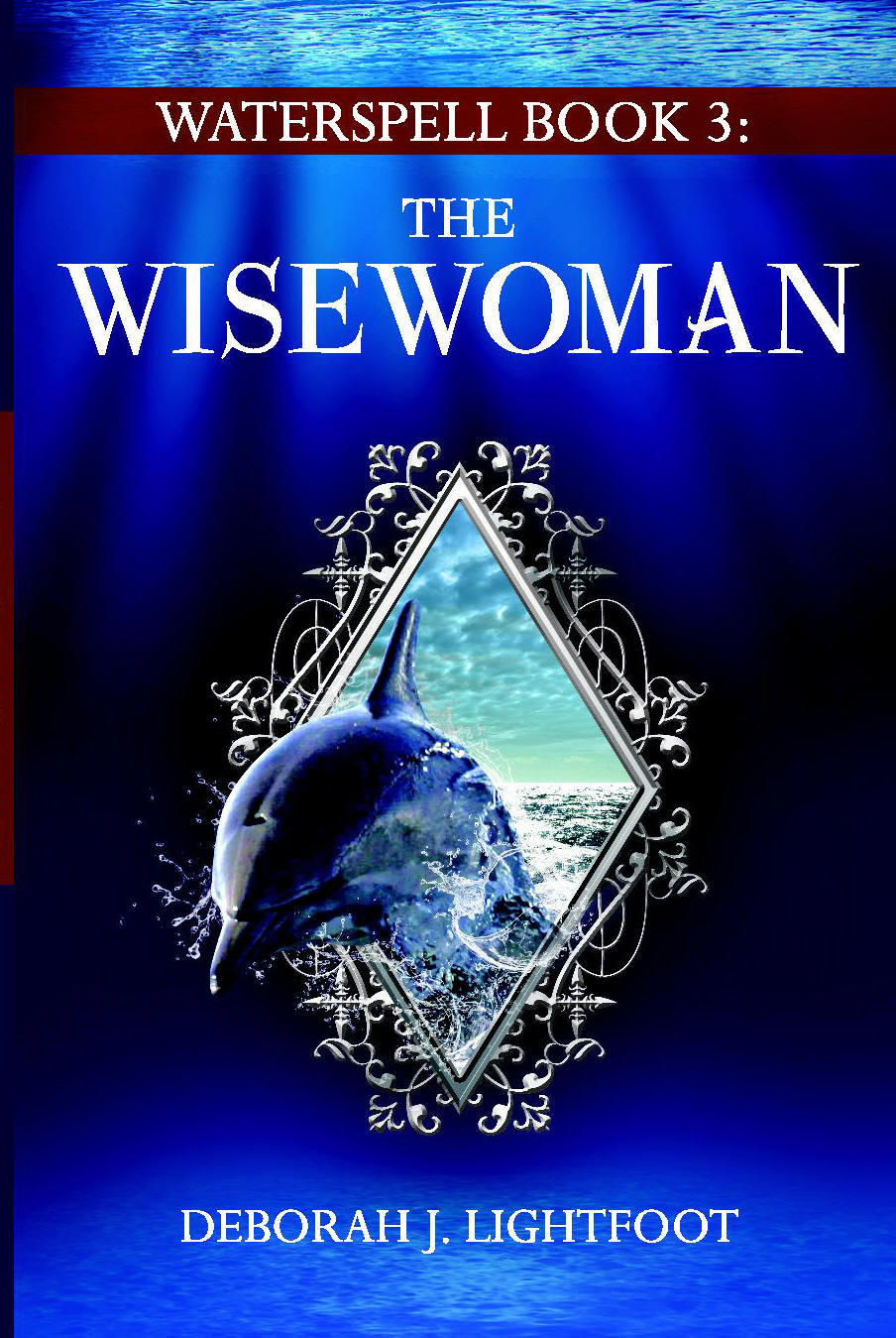
I’m also mulling over changes to the first draft of the Book 3 cover, shown here. I believe the dolphin is too large, and I’d like to see more contrast between it and the background.

Here’s what I’ll request:
  • Move the dolphin to the right so that its dorsal fin is almost centered against the background, and make the dolphin smaller, as necessary, so that its snout/face overlaps the silver frame only about as much as the red-and-gold book overlaps its frame on #8916.
  • The splashes of water are great—perfect! Can you add another splash or two under the dolphin’s snout, to provide more contrast against the dark-blue background?
  • Within the silver frame, change the sky-and-sea background to a golden sunset. There’s an excellent example at http://sandeep.pixelring.net/photoblog/images/20080914132754_dsc02610_small.jpg (minus the human silhouette, of course).

FOUR STAR FUNERALS
ISBN 978-0-9728768-2-7 (E-book)

Cover art copyright © 2011 David R. Davis
All rights reserved
I said I had three things on my mind this morning, but actually I have four. I’m also trying to master the ridiculously long “Smashwords Style Guide” so I can successfully e-publish an anthology written by the Four Star Writers of my critique group. More on this venture, later.

Right now, I gotta get to work!


Steps to Publication #4: Choosing a POD Printer


With my “Ready-To-Sell Package & eCombo Package” from Accurance, I am to get e-book distribution (which I kind of understand, being an experienced downloader and reader of e-books from Barnes & Noble and Smashwords), but I’m also going to get a books-printed-on-paper account set up for me, with the print-on-demand (POD) publisher that “best suits” me.

To quote from Accurance.com:
"Accurance has worked hard through the years to choose POD publishers and printers that we feel strongly [about] recommending to our authors. These companies must meet strict criteria for low price, high quality, experience, service level, and much more. Though we are always researching, we currently work with three such companies. Our expertise in publishing allows us to be able to match the perfect publisher to each of our authors, and then do all the work to get your book on the market. Currently we are recommending one of the three firms:
• LULU
• CreateSpace
• Lightning Source (LSI)”

Lightning Source (LSI)

Lightning Source, an Ingram subsidiary, is “the leading printer and distributor of print-on-demand books,” according to Wikipedia. Lightning Source works with publishers. According to the LSI website, a small publisher receives the following services:
Print to Order

           The publisher sets the retail price, wholesale discount, and return policy.
           We send the data out to our Distribution partners (including leading distributors such as Ingram, Baker & Taylor, Barnes & Noble, Amazon.com, and others).
           They capture the demand from booksellers, libraries, and consumers and we print to fill the order.
           We collect the wholesale price, deduct the print cost, and pay the publisher the balance.
           The price for this service is $12.00 a year per title.
           To avoid book buyers having to backorder, Lightning Source guarantees that books ordered by Ingram will be printed and returned to their [Ingram's?] shipping dock within 8-12 hours, generally in time to be included in the book buyer’s regular order.
What services does Lightning Source provide for the $12 per year Digital Catalog Fee?
           Standardized BISAC subject coding with up to 3 subject categories.
           Detailed title listing in all daily catalogs Lightning Source provides to its U.S. distribution partners (e.g., Ingram, Baker & Taylor, Amazon.com, etc.).
           Detailed title listing in all daily catalogs Lightning Source provides to its International distribution partners (e.g., Amazon UK, Whitakers/Bookdata, Gardners, etc.).
           Title summary (annotation) inclusion in our enhanced bibliographic catalog feed.
           Thumbnail cover image preparation and inclusion in our enhanced bibliographic catalog feed.
That all sounds pretty good. Well worth the $12 a year. Especially if the following printing-cost info from “Self-Publishing with Lightning Source POD” (dated 2007) is still valid:
“Lightning Source as a printing option removes nearly all risk from being [an independent small] publisher. There is an initial setup cost of approximately $100, and apart from a few ancillary costs (e.g. purchasing an ISBN for your book) that is the complete financial risk. Once set up, the cost per book (for paperback) is around $1 flat fee, plus around a cent and a half per page (so a 200-page book costs $3.50 to print, while a 500-page book costs $7.40 to print). Finally, there is an ongoing listing fee of $12 per book each year. Mind you, this fee gets your book registered on both LS in the US and the UK (and as such, Amazon US and UK)—a trivial amount when you consider you can recoup it with two sales.”

What About Lulu and CreateSpace?

I have gotten the feeling, from my communications with the folks at Accurance, that they tend to steer their clients toward Lulu. Of Lulu, Wikipedia says:
“The retail price for the published item is determined based on printing costs, the author’s selected profit margin, and the fee charged by the distributor for distributed items. Printing costs for books are correlated to the page count, paper size, binding type, and color or black-and-white print. The author’s margin is partitioned into 80% for the author and 20% for Lulu.”
That’s pretty general: I need specifics. At Lulu.com, I couldn’t readily find info about costs and pricing, but here are interesting details from Crimson Melodies:
“CreateSpace offers much, much better prices on POD books than Lulu (seriously, half the price pre-retail markup) … printing a 280-page book on Lulu costs just over $10 before retail markup. On CreateSpace, that same book (if you invest $40 in the pro-plan) is only $5 before retail markup …

“For a 280-page, 6x9 dimension book, retailed at $12.99 (assume CreateSpace pro-plan):
Single Copy Cost
CreateSpace: $4.21
Lulu: $10.10 (actual manufacturing cost is $7.10, but $10.10 is your cost to buy)
(Coincidentally, CreateSpace says it costs $7.10 for one book without the pro-plan.)”

What Will My 400-Page Fantasy Novels Cost to Print?

The figures cited by Crimson Melodies alarm me. $10.10 for a 280-page book works out to about $0.036 per page. So for my 400-page novels, the cost of printing (before retail markup) could be around $14.50 at Lulu.

All things considered—and especially considering the thickness of the three books of WATERSPELL—I’m thinking that Lightning Source could be my best bet.

This is definitely something to discuss with my account representative (“Author partner”) at Accurance.

In a later blog posting, I’ll let you know which way we decide to jump.

Steps to Publication #3


It’s dizzying, how quickly things move in the production arena, compared with the creation arena. After spending years on the writing and editing of WATERSPELL, I’m seeing the books come together with lightning speed.

First above is the final cover for Waterspell Book 1: The Warlock. Under it is the first revision of the Book 2 cover.

Compare the first draft of the Book 2 cover (posted earlier) with this one, and you’ll see that the design folks at the Accurance Group are very good at following instructions. And fast. They took my long list of changes and whipped them into the design in under 12 hours.

(I’m guessing that my designer is in India. I e-mailed my change request on Sunday, August 21, at about 5 p.m. Central time, and the revised cover awaited me in my Inbox when I got to work this Monday morning.)

I’m taking the Book 1 and Book 2 covers to a meeting of my Critique Group tomorrow, for the opinions of my friends and colleagues. Some may say the title ribbon on Book 2 should be red, to match the (deliciously ominous) red in the clouds. But the color green appears in the clothing of a major character in Book 2, and a red touch adorns the clothes of a major character in Book 3. So I believe I’ll keep the green title ribbon for Book 2, and reserve red for the title background of Book 3.

Book 1: First Galley Proofs

Also awaiting me in my e-mail this morning was the 380-page galley proof of the typeset Book 1. At first glance, it looks good. My wonderful husband, Gene, has volunteered to proofread. After so many passes through the manuscript, myself, during the revision stage, I do not believe I could manage another read-through without my eyes crossing. (Did I mention: I’ve spent years on this project.)

One omission pops out at me immediately: They neglected to insert the copyright page, dedication, Contents, and epigraph that I provided in a separate file named “Book 1 front matter.” The lesson is: Put all text in one file, or something’s bound to be overlooked.

They have provided a “Galley Edits Correction Sheet” with which I am to communicate my changes to the text, and I get three full revision cycles, so I do not expect to have much trouble getting the missing “front matter” inserted where it belongs.

Another thing that pops out at me is that this is not “fine” typesetting. There’s no kerning. And long words that fall at the ends of lines are not hy-phen-at-ed. So any strings of longish words result in      wide     word     spacing,     with     lots     of     white     space     between.

That seems to be the norm in the digital age. When reading on my NOOK 1st edition (where I enlarge the type to almost the biggest font they’ve got) I often     encounter     wide    word    spacing    that could have been eliminated by a little judicious hy-phen-ation. I guess we’ll all get used to it. Or maybe the pro-gram-mers will come up with an easy way for hyphens to magically appear where they’re needed on one person’s display screen or device, but disappear when they’re not needed on another reader’s screen or device.

(In digital publishing, short words yield the best visual results. That’s a good in-cen-tive to Keep It Simple, All Ye Scribes.)

Updating My Various Websites

Over the years, I have created (then sort of abandoned) three websites. My first one resides at http://home.earthlink.net/~djlsbooks/. It looks old-fashioned now. I used site-creation software that, by today’s standards, is obsolete. I need to troll that site for anything worth keeping, and move the material into one of my more current sites.

For my next attempt, after that early DIY site that I haven’t touched since 2009, I rented space at AuthorsGuild.net. I’ve done better with that one, keeping it slightly more up-to-date. I desperately need to redo its Home Page, however.

Newest is my second AuthorsGuild.net site, which I’m devoting exclusively to WATERSPELL. Since it’s shortest and simplest, I’ll work on it next, in hopes of getting something together that won’t shame me when all the hordes of eager readers flock to my site to learn more about the brilliant author of WATERSPELL. [LOL]

A Handy PDF-to-JPG Conversion Tool

The cover files from Accurance.com are coming to me as PDFs. I need the .jpg format for uploading to this blog. So I’m using a fast, free conversion tool: pdf to jpeg online converter.

Once I have the full covers in jpeg format, I use my photo-editing software to crop off the back cover and spine, leaving just the front cover with which to illustrate my Web pages.


All this techno-work is putting different demands on my brain, exercising the parts that don’t necessarily come into play when I’m writing and editing. I’m sure it’s good for me.

Stay tuned: I’ll post all the riveting details as my indie publishing adventure continues.


Steps to Publication #2


Got the first proof of the cover for WATERSPELL Book 2: The Wysard from the production team at the Accurance Group. It's pretty awful! Some of the problems are my fault—I specified a blue background "in a shade to complement the Book 1" cover, but after seeing them side by side, I think the deep-blue-sea of the Book 1 cover is the way to go for all three volumes. To distinguish one from another, we'll change the background colors of the title "ribbons" on the front cover and the spine.

These are my instructions for cover edits:
  • Use the same "deep blue sea" background—and dark-blue spine—as for #8916.
  • On the front cover, give the title "ribbon" a vivid green background to match the green of the water-lily leaf.
  • No italics for the word WYSARD. (Italics look odd in that particular font.)
  • Within the frame, put touches of moderately dark (but fiery) sunset-red in the clouds to suggest a storm or the coming of dusk. (And to provide a contrast for the white water lily in the foreground.)
  • Match the flower's relative size and perspective (its relative position or angle) within its frame to that of the red-and-gold book within its frame (on #8916).
  • On the spine, change the number 1 to 2.
  • No italics for the word WYSARD.
  • Use the same vivid green background for the spine's central title block as for the title ribbon on the front cover.

I'll shoot these instructions back to the Production Team today. It'll be interesting to see how close (or not) they come in the second proof.

I'm sharing the step-by-step process with everybody so you can decide for yourself whether you want to use the services of the Accurance Group. So far, so good, from my point of view. I thought the designer could have shown a little more initiative with my Book 2 cover, and seen for herself/himself that the angle or perspective of the water-lily blossom does not match the angle/perspective of the red-and-gold book on the cover of WATERSPELL Book 1: The Warlock.

But then again, I've worked with art departments, on mainstream projects, that didn't get anywhere near this close on the first try, when working from written instructions. So really, Accurance's team has made a respectable first try on this cover.

Stay tuned—my indie publishing adventure continues!


Steps to Publication

I have ticked so many things off my To-Do list in the last few weeks, I hardly know which milestone to blog about. I’ll begin by listing them, and then go into greater detail in subsequent postings.

WATERSPELL UPDATE:
Book 2, The Wysard

I finished my “final” read-through of the manuscript, with an eye toward ensuring continuity and consistency through the three-book series. While reading, I kept in mind Stephen King’s excellent advice from On Writing: A Memoir of the Craft: “Write with the door closed, rewrite with the door open. Your stuff starts out being just for you, in other words, but then it goes out.”

Since I’m on the verge of sending my trilogy out the door, I was particularly focused on making it as smoothly readable as I could. Those who have read WATERSPELL in ms. tell me that my writing is engagingly smooth. To quote the dictionary definitions, it’s “even and uninterrupted in flow” and “free from lumps.” (Nobody wants a lumpy book.) To enhance the readability of Book 2 as much as possible, I shortened and simplified some words, sentences, and paragraphs. All the 19th-century English lit that I have read has had a noticeable influence on my writing style, and I must make a conscious effort to tighten my work—“crisp it up”—for an impatient modern audience.

E-PUBLISHING and PRINT PUBLISHING

For interior formatting, cover design, print publishing and distribution, and e-book conversion and distribution, I chose Accurance.com and their “Ready-To-Sell Package & eCombo Package.” And my stars!—those folks are fast. On Monday afternoon, I delivered my manuscript for WATERSPELL Book 1: The Warlock to the Accurance Group's Bill Earle via e-mail, and the first proof of the cover art (shown above) awaited me in my Inbox on Wednesday morning!

The cover is very close to being exactly what I wanted. I’m going to run it by my critique group, though, for their expert opinions. We have a professional artist and illustrator among our members, and all of us are published, and so we have all had experiences with cover art—some great experiences, and some disappointing.

BOWKER and ISBNs

Also this week, I accessed the ISBN logbook for Seven Rivers Publishing at BowkerLINK. It’d been “a while” (years) since I’d last used my ISBN account, and I was relieved to discover that my old username and password still worked. I used Bowker’s extremely clunky and clumsy interface to enter bibliographic details for five ISBNs, as follows:

ISBN 978-0-9728768-2-7, Four Star Funerals: An Anthology about Death (E-book)
ISBN 978-0-9728768-3-4, WATERSPELL Book 1: The Warlock (E-book)
ISBN 978-0-9728768-4-1, WATERSPELL Book 1: The Warlock (Trade Paper)
ISBN 978-0-9728768-5-8, WATERSPELL Book 2: The Wysard (E-book)
ISBN 978-0-9728768-6-5, WATERSPELL Book 2: The Wysard (Trade Paper)

I’ll explain the first one, FOUR STAR FUNERALS, in a later posting.

You’ll notice that each edition or format of the WATERSPELL books has its own ISBN: one for the e-book, and one for the paperback. With Bill Earle and his team at Accurance.com, I’m now working on producing the paperback edition of WATERSPELL Book 1, and I’ve checked the ISBN at least 20 times, to be sure we have the correct one on the cover and on the copyright page. The numbers are all so similar, it’s frightfully easy to get them confused.

A NEW WATERSPELL.NET WEBSITE

Also this week (did I mention that I’ve been busy?) I started the process of totally revamping my Waterspell.net (Waterspell.com—it’s the same destination) website. My existing one is dark, cluttered, and sort of dated in appearance. And to my horror, I find that I have not touched the site since October 2009. I’ve spent my time writing and revising, instead of networking and marketing.

Once I have the final covers for the three books of WATERSPELL, I’ll upload them to my fresh, new, clean and uncluttered site at http://members.authorsguild.net/waterspell/.

Then I’ll move all the text (or the stuff that’s worth keeping) out of my old, neglected site at http://home.earthlink.net/~djlsbooks/ and into this blog, where I can save it for posterity.

LOOKING AHEAD to WATERSPELL BOOK 3: THE WISEWOMAN

The rough draft of Book 3: The Wisewoman is now out with my editorial review board—my trusted first-readers. I aim to release the first two books in October 2011, and the third one in May 2012. That should give me time to polish up Book 3 and get it ready for publication.

But I want all of the covers done now, while I have Bill and his design team on the job at Accurance.com. So I need to decide what excerpt to pull from the body of Book 3 to put on its back cover.

Which is what I’m going to go think about right now, after I post this progress report.

Through this report, you-all who haven’t had an e-mail or a phone call from me in ages can now understand, I hope, why I’ve been incommunicado. Life’s been full. And very satisfying. I’m getting things done, lickety-split. And all on my own terms.