Manuscripts: Shred ’Em or Store ’Em?

A recent Angie’s List “Big Deal” offered mobile shredding at a deep discount. Sierra Shred of Frisco, Texas, will come out to my place and shred 600 pounds of sensitive documents for just $65—half off the normal price.

Since signing up for a visit from Sierra’s shredder truck, I’ve been busy going through closets and file cabinets, gathering up ancient tax return documents, bank statements, canceled checks, credit card statements and the like. What a joy it will be to see that clutter get safely shredded and hauled off for recycling.

DRAFT MANUSCRIPTS TOO?

Other piles of paper are giving me pause, however. I have old drafts of my WATERSPELL trilogy going back for … well, going back a lot of years (more than I care to confess).

I know I don’t need to keep all those drafts. But I’ve never been comfortable tossing complete manuscripts—even draft manuscripts—into the regular recycled-paper bin. It’s not like I’m a famous author whose fans will go dumpster-diving to get a pre-release peak at my latest creation. Even so: I’ve been boxing my old drafts rather than let my husband take them to our neighborhood recycling center along with our junk mail, expired magazines, and exhausted newspapers.

Now’s my chance to permanently dispose of those old drafts. Once they are shredded, I can rest easy knowing that my intellectual property is safe from dumpster-divers.

FOR POSTERITY?

Yet, I’m reluctant to get rid of ALL my drafts. The incremental ones can go—those with only cleanup edits from printout to printout.

I’ve decided to save the oldest drafts, however, and any that show the deep revisions I made as I progressed in my understanding of the history I was recording. The world of WATERSPELL became a very real place to me during all the years I spent learning about it, its inhabitants, and its history. To throw away my archives would be a vandalic act.

But at least I can reduce the volume of stored manuscripts by a third or more. And maybe when I become famous (!) a well-known research library will ask me for my draft manuscripts so students and scholars can follow the evolution of WATERSPELL from start to finish.

I’d best keep the phone number for Sierra Shred, though, in case nobody ever expresses a burning desire to study my authorial process. (Hmm … Maybe it’s best that no one but my closest writer-friends ever see those earliest drafts.)

SPEAKING of CLEARING OUT the CLUTTER … 

All this spring-cleaning activity (never mind that it's fall—I do my spring cleaning as the spirit moves me) inspired me to post a de-cluttering essay at Smashwords.

It's free—please help yourself to "SIMPLE GREEN: Confessions of a Former Earthchild" at smashwords.com/books/view/93173

Here's the synopsis:
SIMPLE GREEN: CONFESSIONS OF A FORMER EARTHCHILD, by a semi-lapsed environmentalist, is a rumination on keepsakes and mementos and how best to Reduce, Reuse, & Recycle them after somebody dies and leaves all their stuff behind—a life’s residue, inevitably destined for the landfill, unless a sentimental collector intervenes. A personal essay/memoir by Deborah J. Lightfoot, author of the WATERSPELL fantasy trilogy.


TASK 2: The Text Formatting Is Finished


Oh happy day! It’s been like pulling teeth to get to this point, but FINALLY the Accurance Group has finished the interior formatting for WATERSPELL Book 1: The Warlock, and also for Book 2: The Wysard.

I expected this part of the process to be quick and easy. They took the text straight from my Word .doc files and formatted it as printable PDFs with running heads and justified margins. “What could go wrong?” I asked myself.

Let me count the ways:

ENDLESS REVISION After ENDLESS REVISION

ORIGINAL OUTPUT (8/22/2011): They omitted all of the front matter that I’d supplied: copyright page, dedication, Contents page, epigraph.

FIRST REVISION (9/6/2011): They inserted the front matter OK, but they introduced a typo (theirs, not mine) into the dedication page, a strange, stray hyphen: “an–d its sequels.”

SECOND REVISION (9/14/2011): Whereas I’d been expecting this run of galley proofs to be the final, clean copy, they inexplicably fouled up the established, customer-approved pagination scheme. They dropped the blank book-page (a page that we’d intentionally left blank) after the Prologue, with the result that all of the pages from Chapter 1 to the end of the book were no longer correctly numbered. They replaced the formerly correct page numbers on the Contents page with the now-incorrect page numbers. Instead of centering the epigraph on the page facing the Prologue, they set it flush-left. And they mistakenly slapped running heads on the first page of the Prologue and the first page of Chapter 1. (I described this mess in detail at "Me, My Team, and DIY.")

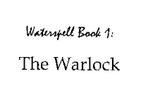
THIRD REVISION (9/17/2011): Things got quite interesting at this point. Previously, the first line of the book’s title, on the title page, had been set in the font shown at left. I wasn’t crazy about it, but it was readable and I was OK with it. But suddenly, on this particular proof run, that first line showed up in Mistral (calligraphic—second image at left).

 “Wow!” I thought. “Somebody is finally taking an interest in this project. They’ve given some thought to how a faux-medieval fantasy novel should be presented.” I’m not sure I would have chosen Mistral, if I’d been doing the choosing, but I was so pleased to see a glimmer of interest on the part of the typesetter, I happily accepted this change of typefaces.

But the danged epigraph was still not right. They’d finally got it centered left-to-right, but it was crowding the top margin. While all of this back-and-forth had been happening with Book 1, Accurance had successfully finished the page formatting for Book 2. And the Book 2 epigraph was attractively centered on its page, both horizontally and vertically (top-to-bottom as well as left-to-right). Of course, I wanted the Book 1 epigraph to be presented the same as the Book 2 epigraph (this is a series, after all); and so that is what I requested.

FOURTH REVISION (9/30/2011): Oh my God! Will you LOOK at what they did to the first line of the title, on the title page? Without authorization—without a word of permission from me—they changed the font from Mistral to some kind of dreadful Edwardian script. Nothing could be less appropriate for these world-hopping science-fictional fantasy novels of mine. I almost puked. (I fully lost my temper.)

On the plus side, the epigraph had finally found its proper spot in the middle of the page facing the Prologue, but the line-breaks within the epigraph were still not correct. No matter how many times I said to “Set it up like the epigraph in job # 8917” (their number for my Book 2), they had failed to do it.

Of course, by this point I would have let the danged epigraph go, in the interest of moving these books along to the next process. (I was hoping for an October release date for the POD paperbacks, but that’s unlikely to happen now.)

Under no circumstances, however, could I accept that horrible Edwardian script on the title page. So I sent the proofs back for yet another run.

FIFTH REVISION (10/4/2011): Oh happy day! Mistral is back on the title page, the Book 1 epigraph finally looks like the Book 2 epigraph, I’ve signed off on the galley proofs, and we can finally go to the next step. It’s taken at least two weeks longer than it should have to get to this point, but at last we can proceed.

LOOKING AHEAD: TASKS 3 and 4

The package of services I bought from Accurance.com includes (1) cover design, (2) interior formatting, (3) print publishing setup and distribution, and (4) e-book conversion and distribution.

Now that we’re finally finished with steps 1 and 2—covers and interiors—I’m hoping that steps 3 and 4—POD publishing (Lightning Source) and e-book distribution—will move along quickly and simultaneously.

If you can stand the suspense, keep checking here on my blog. I’ll continue to post progress reports.


FOUR STAR FUNERALS: An Anthology About Death


It’s published! The e-book written by the members of the Four Star Critique Group is now available at Smashwords: http://www.smashwords.com/books/view/93148

We’re proud of it. This is our first venture, as a group, into e-publishing. Without doubt, we’ll do more.

Cover art copyright © 2011
by David R. Davis
FOUR STAR FUNERALS: AN ANTHOLOGY ABOUT DEATH (in three parts: Memoir, Poetry, & Fiction) packs the emotional wallop of Titanic, darkened with a dash of Tales From the Crypt. This 10-author anthology about death and its aftershocks will sear your soul, make you laugh … and ultimately help you heal, if you’re haunted by a death that has upended your emotions in ways you never expected.

By Ann Barrington, David R. Davis, Melissa Russell Deur, Patricia Holland, Kathryn Lay, Deborah J. Lightfoot, Martha Moore, Cecile Odell, Diane Roberts, and BJ Stone.

Click here to read about the history of this project.

SIMPLE GREEN: CONFESSIONS OF A FORMER EARTHCHILD

After e-publishing our FUNERALS anthology today, I also published a short piece that’s in the same vein, but it didn’t quite fit in the collection. SIMPLE GREEN is available for free at Smashwords.

SIMPLE GREEN: CONFESSIONS OF A FORMER EARTHCHILD, by a semi-lapsed environmentalist, is a rumination on keepsakes and mementos and how best to Reduce, Reuse, & Recycle them after somebody dies and leaves all their stuff behind—a life’s residue, inevitably destined for the landfill, unless a sentimental collector intervenes. A personal essay/memoir by Deborah J. Lightfoot, author of the WATERSPELL fantasy trilogy.


 Please take a look. I hope you enjoy both books.

ADOBE DIGITAL E-READER SOFTWARE: IT'S FREE!
For free e-reader software (it lets you read e-books on your computer, if you don't have a Nook, Kindle, etc.) download Adobe Digital Editions.